步进器 ui-stepper
引用组件,请参考说明文档,下面的引入只是作为演示,实际引入路径,请根据您的项目架构更改。
"usingComponents": {
    "ui-stepper" : "/packageB/components/ui-stepper/ui-stepper"
}
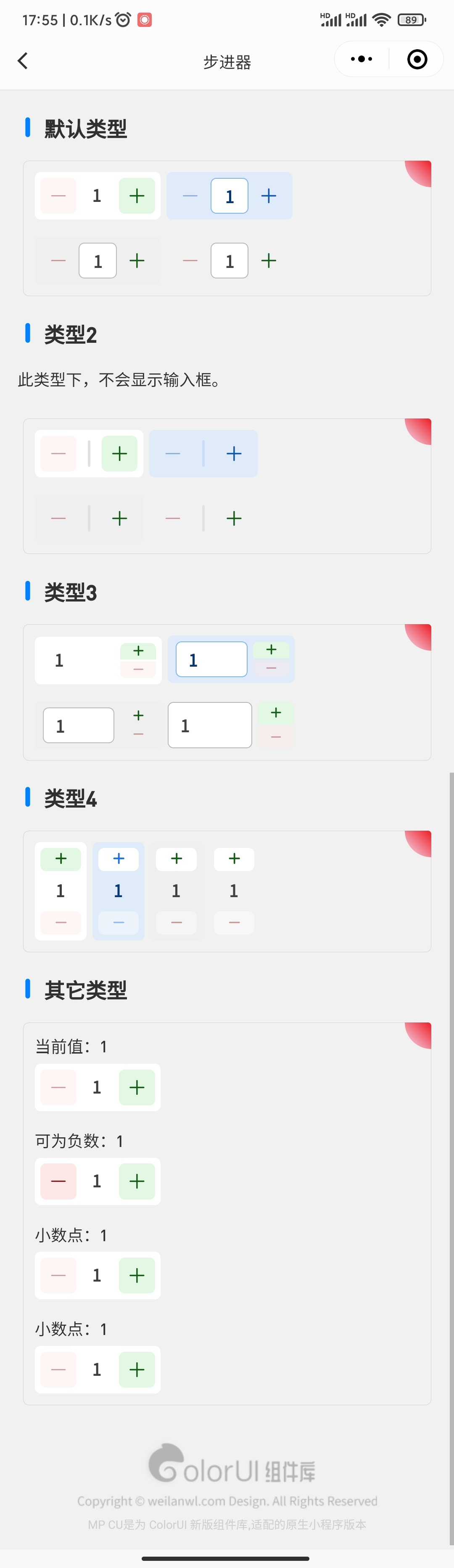
默认类型
<ui-stepper/>
<ui-stepper theme="blue"/>
<ui-stepper theme="grey"/>
<ui-stepper theme="no-bg"/>
类型2
<ui-stepper tpl="2" />
<ui-stepper tpl="2" theme="blue"/>
<ui-stepper tpl="2" theme="grey"/>
<ui-stepper tpl="2" theme="no-bg"/>
类型3
<ui-stepper tpl="3" />
<ui-stepper tpl="3" theme="blue"/>
<ui-stepper tpl="3" theme="grey"/>
<ui-stepper tpl="3" theme="no-bg"/>
类型4
<ui-stepper tpl="4" />
<ui-stepper tpl="4" theme="blue"/>
<ui-stepper tpl="4" theme="grey"/>
<ui-stepper tpl="4" theme="no-bg"/>
其它类型
<view>当前值:{{val}}</view>
<view class="mt-2">
    <ui-stepper val="{{val}}" maxVal="10" bind:onCut="onCutVal" bind:onAdd="onAddVal" bind:onVal="onVal"/>
</view>

<view class="mt-4">可为负数:{{sval}}</view>
<view class="mt-2">
    <ui-stepper val="{{sval}}" minVal="-10" maxVal="10" noVal bind:onVal="onsVal"/>
</view>

<view class="mt-4">小数点:{{vals}}</view>
<view class="mt-2">
    <ui-stepper val="{{vals}}" maxVal="2" digit bind:onVal="onVals"/>
</view>

<view class="mt-4">小数点:{{valss}}</view>
<view class="mt-2">
    <ui-stepper val="{{valss}}" maxVal="2" digit noVal digits="2" bind:onVal="onValss"/>
</view>
参数
| 参数 | 类型 | 可选值 | 默认值 | 说明 |
|---|---|---|---|---|
| val | Number/String | - | 1 | 数量值 |
| minVal | Number/String | - | 1 | 最小值 |
| maxVal | Number/String | - | 100 | 最大值 |
| digit | Boolean | - | false | 小数点 |
| digits | Number/String | 1-2 | 1 | 小数点位数 |
| theme | String | default,no-bg,grey,blue | default | 主题 |
| tpl | Number/String | 1-4 | 1 | 类型 |
| noVal | Boolean | - | false | 输入框禁止输入 |
| noCut | Boolean | - | false | 禁止减少 |
| noAdd | Boolean | - | false | 禁止增加 |
| item | - | - | - | 附加数据,其它数据,事件内携带返回 |
| uiBox | String | - | - | 背景样式(class) |
| bg | String | - | - | 背景样式(class) |
| bgCut | String | - | - | 减少按钮的背景(class) |
| bgAdd | String | - | - | 增加按钮的背景(class) |
| bgVal | String | - | - | 输入框的背景(class) |
| ui | String | - | - | 其它样式(class) |
| uiCut | String | - | - | 减少按钮的其它样式(class) |
| uiAdd | String | - | - | 增加按钮的其它样式(class) |
| uiVal | String | - | - | 输入框的其它样式(class) |
| bind:onCut | Event | - | event.detail | 减少事件 |
| bind:onAdd | Event | - | event.detail | 增加事件 |
| bind:onVal | Event | - | event.detail | 值改变事件 |
TIP
如果你觉得主题不好看,可根据 样式属性,自行修改。