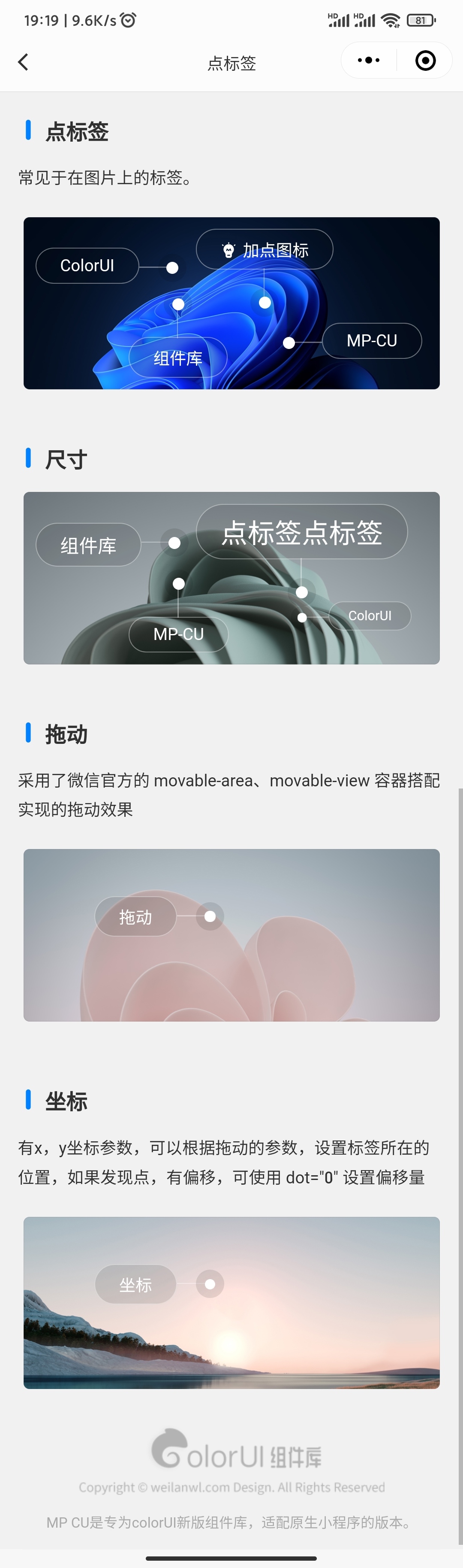
点标签 dot-tag
引用组件,请参考说明文档,下面的引入只是作为演示,实际引入路径,请根据您的项目架构更改。
"usingComponents": {
    "dot-tag" : "/packageB/components/dot-tag/dot-tag"
}
基础使用
<view class="m-2 img-dot-tag">
    <ui-img ui="radius border" src="{{imgA}}"/>

    <dot-tag name="ColorUI" ui="dot-tag-right" animation right bind:tagTap="tapDotTag"/>

    <dot-tag ui="dot-tag-bottom" animation bottom bind:tagTap="tapDotTag">
        <text class="cicon-creative"/>
        <text class="ml-2">加点图标</text>
    </dot-tag>

    <dot-tag name="组件库" ui="dot-tag-top" animation top bind:tagTap="tapDotTag"/>

    <dot-tag name="MP-CU" ui="dot-tag-left" animation left bind:tagTap="tapDotTag"/>
</view>
尺寸
给 ui 参数,添加 sm lg xxl ,控制尺寸。
<view class="m-2 img-dot-tag">
    <ui-img ui="radius border" src="{{imgB}}"/>

    <dot-tag name="组件库" ui="dot-tag-right lg" animation right/>

    <dot-tag name="点标签点标签" ui="dot-tag-bottom xxl" animation bottom/>

    <dot-tag name="MP-CU" ui="dot-tag-top" animation top/>

    <dot-tag name="ColorUI" ui="dot-tag-left sm" animation left/>
</view>
拖动
<view class="m-2 img-dot-tag">
    <!-- movable-area参考文档:https://developers.weixin.qq.com/miniprogram/dev/component/movable-area.html -->
    <movable-area style="width: 100%; height: 154px;">
        <ui-img ui="radius border" src="{{imgC}}"/>
        <movable-view x="{{x}}" y="{{y}}" direction="all" style="height: auto;width: auto;" bindchange="movableChange">
            <dot-tag name="拖动" animation right/>
        </movable-view>
    </movable-area>
</view>
TIP
采用了微信官方的 movable-area 、movable-view 容器搭配实现的拖动效果。
坐标
有 x,y 坐标参数,可以根据拖动的参数,设置标签所在的位置,如果发现点,有偏移,可使用 dot="0" 设置偏移量
<view class="m-2 img-dot-tag">
    <ui-img ui="radius border" src="{{imgD}}"/>
    <dot-tag name="坐标" x="{{x}}" y="{{y}}" dot="1" animation right/>
</view>
数据格式
Page({
    data: {
        imgA: '', imgB: '', imgC: '', imgD: '', x: 60, y: 40,
    },
    onLoad() {
        let list = [];
        for(let i = 1; i< 15; i++) {
            let url = i  < 10 ? '0' + (i) : i;
            list.push('https://cos.color-ui.com/wallpaper/10' + url + '.jpg');
        }
        let imgA = this.getImage(list);
        let imgB = this.getImage(list);
        let imgC = this.getImage(list);
        let imgD = this.getImage(list);
        this.setData({
            imgA: imgA,
            imgB: imgB,
            imgC: imgC,
            imgD: imgD
        })
    },
    getImage(list) {
        return list[Math.floor(Math.random() * list.length)];
    },
    tapDotTag(e) {
        console.log('点击了:' + e.detail)
    },
    movableChange(e) {
        this.setData({
            x: e.detail.x,
            y: e.detail.y
        })
    },
})
参数
name 参数不设置时,开启默认插槽。
| 参数 | 类型 | 可选值 | 默认值 | 说明 |
|---|---|---|---|---|
| ui | String | - | - | 其它class样式 |
| bg | String | - | - | 背景class |
| tagUi | String | - | - | 标签样式 |
| name | String | - | - | 名称 |
| top | Boolean | - | false | 点在上面 |
| left | Boolean | - | false | 点在左边 |
| right | Boolean | - | false | 点在右边 |
| bottom | Boolean | - | false | 点在下面 |
| animation | Boolean | - | false | 点动画效果 |
| x | Number/String | - | - | x轴坐标 |
| y | Number/String | - | - | y轴坐标 |
| dot | Number/String | - | - | 点偏移 |
| bind:tagTap | Event | - | event.detail = name | 标签被点击 |