消息提示 ui-notify
引用组件,请参考说明文档,下面的引入只是作为演示,实际引入路径,请根据您的项目架构更改。
"usingComponents": {
    "ui-notify" : "/packageB/components/ui-notify/ui-notify"
}
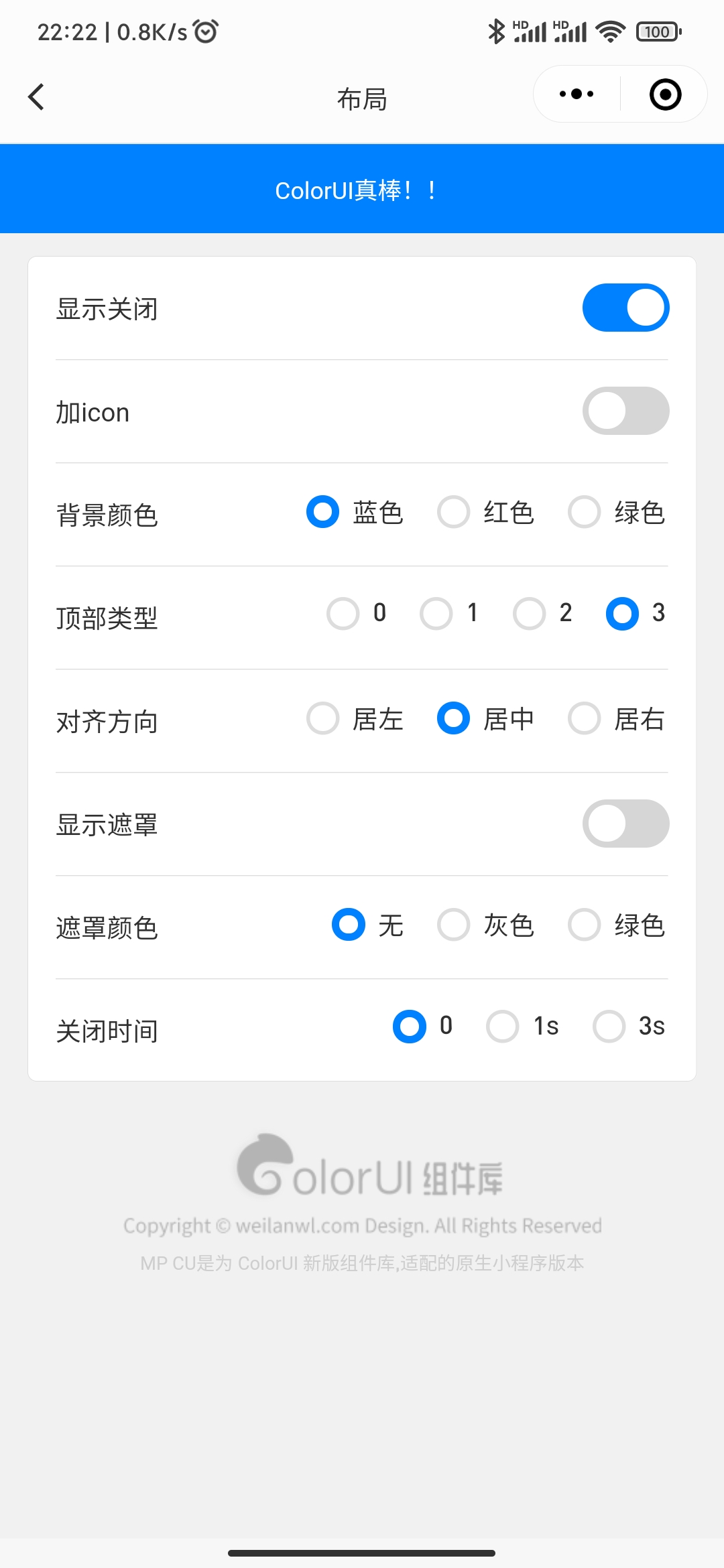
基础效果
<ui-notify msg="ColorUI真棒!!" show/>
加icon
<ui-notify msg="ColorUI真棒!!" icon="_icon-info-o" show/>
背景颜色
<ui-notify bg="bg-red" msg="ColorUI真棒!!" show/>
顶部类型
如果使用原生标题栏,使用0,如果为ColorUI的sys组件,推荐使用3,其它类型,请自行确认使用场景,具体效果,请扫码体验
<ui-notify msg="ColorUI真棒!!" topType="3" show/>
对齐方向
内容的对齐方向,居左,居右,居中。
<ui-notify msg="ColorUI真棒!!" align="center" show/>
显示遮罩
开启遮罩后,下层元素将不会被点击触发事件,触发遮罩被关闭。(用于一些提示消息时,禁止用户操作的业务场景)
<ui-notify msg="ColorUI真棒!!" show mask/>
遮罩颜色
<ui-notify msg="ColorUI真棒!!" show mask maskBg="bg-grey-thin"/>
关闭时间
设置自动关闭时间,默认不会自动关闭。
<ui-notify msg="ColorUI真棒!!" duration="1500" show/>
参数
| 参数 | 类型 | 可选值 | 默认值 | 说明 |
|---|---|---|---|---|
| ui | String | - | - | 其它样式(class) |
| bg | String | - | - | 背景样式(class) |
| icon | String | - | - | 图标类名(class) |
| msg | String | - | - | 消息内容 |
| show | Boolean | - | false | 是否显示 |
| topType | Number/String | 0,1,2,3 | 2 | 顶部类型 |
| align | String | left,center,right | center | 对齐方向 |
| duration | Number/String | - | 0 | 展示时长(ms),值为 0 时,不会消失 |
| mask | Boolean | - | false | 遮罩,禁止点击下层元素 |
| maskBg | String | - | - | 遮罩背景(class) |
| bind:close | Event | - | false | 消息被关闭 |
| bind:msgTap | Event | - | - | 消息被点击 |
| bind:maskTap | Event | - | - | 遮罩被点击 |