标题 ui-title
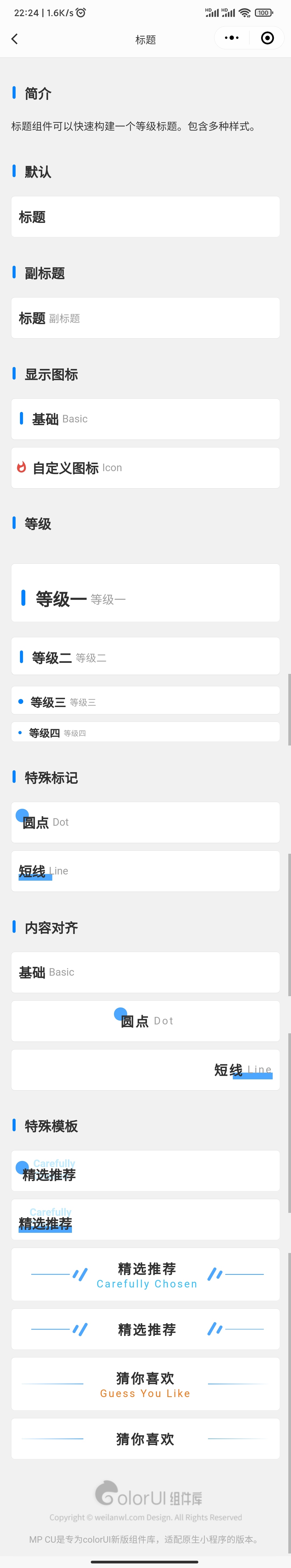
标题组件可以快速构建一个等级标题。包含多种样式。
"usingComponents": {
    "ui-title": "mp-cu/colorUI/components/ui-title/ui-title"
}
默认
<ui-title title="标题"/>
副标题
<ui-title title="标题" desc="副标题"/>
显示图标
<ui-title title="基础" desc="basic" isIcon/>
自定义图标
<ui-title title="自定义图标" desc="icon">
    <text slot="icon" class="text-red cicon-whatshot"/>
</ui-title>
等级
不同等级字号、上下边距、默认的图标会不一样。 depth="{1~4}"
<ui-title title="等级一" desc="等级一" isIcon depth="1"/>
<ui-title title="等级二" desc="等级二" isIcon depth="2"/>
<ui-title title="等级三" desc="等级三" isIcon depth="3"/>
<ui-title title="等级四" desc="等级四" isIcon depth="4"/>
特殊标记
圆点 hasDot="true" , 短线 hasLine="true"
<ui-title title="圆点" desc="dot" hasDot/>
<ui-title title="短线" desc="line" hasLine/>
内容对齐
内容对齐 align="{left / center / right}"
<ui-title title="基础" desc="basic" align="left"/>
<ui-title title="圆点" desc="dot" align="center" hasDot/>
<ui-title title="短线" desc="line" align="right" hasLine/>
特殊模板
tpl="stack" hasDot
<ui-title title="精选推荐" titleColor="text-blue" descUi="text-cyan" desc="Carefully chosen" tpl="stack" hasDot/>
tpl="stack" hasLine
<ui-title title="精选推荐" titleColor="text-blue" descUi="text-cyan" desc="Carefully chosen" tpl="stack" hasLine/>
tpl="center-column" hasDot
<ui-title title="精选推荐" titleColor="text-blue" descUi="text-cyan" desc="Carefully chosen" tpl="center-column" hasDot/>
<ui-title title="精选推荐" titleColor="text-blue" tpl="center-column" hasDot/>
tpl="center-column" hasLine
<ui-title title="猜你喜欢" titleColor="text-red" descUi="text-orange" desc="Guess you like" tpl="center-column" hasLine/>
<ui-title title="猜你喜欢" titleColor="text-red" tpl="center-column" hasLine/>
参数
| 参数 | 类型 | 可选值 | 默认值 | 说明 |
|---|---|---|---|---|
| ui | String | - | - | 其他class |
| bg | String | - | bg-none | 背景颜色 |
| title | String | - | - | 标题名称 |
| desc | String | - | - | 副标题 |
| titleUi | String | - | ui-TC | 标题class |
| descUi | String | - | ui-TC-3 | 副标题class |
| depth | Number/String | 1 ~ 4 | 0 | 等级字号 |
| dot | String | - | ui-BG-Main | dot的class |
| line | String | - | ui-BG-Main | line的class |
| isIcon | Boolean | - | false | 显示图标 |
| hasDot | Boolean | - | false | 圆点 |
| hasLine | Boolean | - | false | 短线 |
| align | String | left, center, right | left | 内容对齐 |
| tpl | String | - | default | 特殊模板 |
| inLine | Boolean | - | false | 线 |
插槽
| 参数 | 说明 |
|---|---|
| 默认 | 标题区的内容 |
| icon | 自定义图标 |
| more | 更多内容 |