模态框 ui-modal
"usingComponents": {
    "ui-modal": "mp-cu/colorUI/components/ui-modal/ui-modal"
}
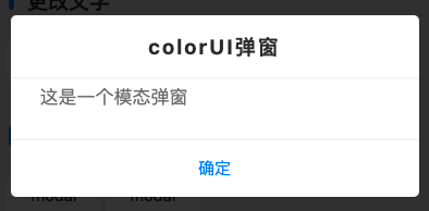
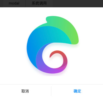
系统调用
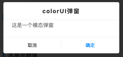
this.$showDialog({
    title : 'colorUI弹窗',
    content: '这是一个模态弹窗',
    success: res => {
        console.log(res)
        if(res.confirm){
            this.$success({
                title : '点击了确定'
            })
        }else{
            wx.showToast({
                title: '点击了取消',
                icon : 'none'
            })
        }
    }
})
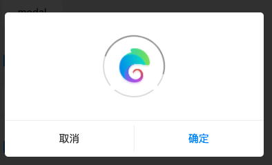
自定义-1
<ui-modal show="{{true}}" dialog="width:auto" option="{{false}}">
    <view class="p-4">
        <ui-loading color img="/static/logo.png"/>
    </view>
</ui-modal>
自定义-2
<ui-modal show="{{true}}" bind:success='success'>
    <view class="p-5 flex-center">
        <ui-loading color img="/static/logo.png"/>
    </view>
</ui-modal>
不显示取消
组件调用
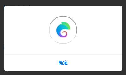
<ui-modal show="{{true}}" showCancel="{{false}}">
    <view class="p-5 flex-center">
        <ui-loading color img="/static/logo.png"/>
    </view>
</ui-modal>
系统调用
this.$showDialog({
    content: '这是一个模态弹窗',
    showCancel: false,
    success: res => {
        console.log(res);
    }
});
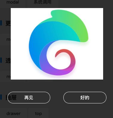
更改文字
组件调用
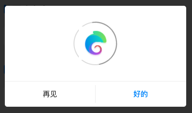
<ui-modal show="{{true}}" cancelText="再见" confirmText="好的">
    <view class="p-5 flex-center">
        <ui-loading color img="/static/logo.png"/>
    </view>
</ui-modal>
系统调用
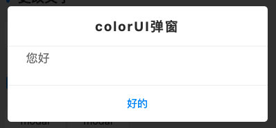
this.$showDialog({
    content: '您好',
    cancelText: '再见',
    confirmText: '好的',
    success: res => {
        console.log(res);
    }
});
透明
透明-1
<ui-modal show="{{true}}" transparent mask="40" iconCancel>
    <view class="p-5 flex-center">
        <image src="/static/logo.png" mode="aspectFill"/>
    </view>
</ui-modal>
透明-2
<ui-modal show="{{true}}" cancelText="再见" confirmText="好的" transparent mask="40">
    <view class="p-5 flex-center">
        <image src="/static/logo.png" mode="aspectFill"/>
    </view>
</ui-modal>
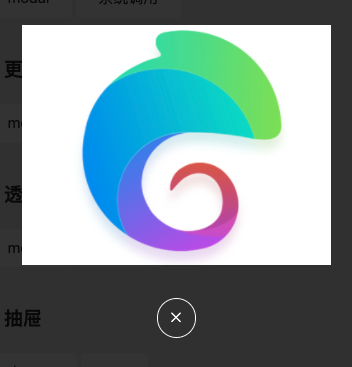
抽屉
drawer
<ui-modal show="{{true}}" mask="40" align="bottom">
    <view class="p-5 flex-center">
        <image src="/static/logo.png" mode="aspectFill"/>
    </view>
</ui-modal>
top
<ui-modal show="{{true}}" mask="40" align="top">
    <view class="p-5 flex-center">
        <image src="/static/logo.png" mode="aspectFill"/>
    </view>
</ui-modal>
系统调用参数
系统调用时,不需要挂载组件
| 参数 | 类型 | 可选值 | 默认值 | 说明 |
|---|---|---|---|---|
| title | String | - | - | 标题 |
| content | String | - | - | 内容 |
| showCancel | Boolean | - | true | 显示取消按钮 |
| cancelText | String | - | 取消 | 取消按钮文字 |
| confirmText | String | - | 确定 | 确认按钮文字 |
| success | Event | - | res | 事件 |
组件参数
| 参数 | 类型 | 可选值 | 默认值 | 说明 |
|---|---|---|---|---|
| show | Boolean | - | false | 是否显示 |
| noNav | Boolean | - | false | 排除状态栏区域 |
| ui | String | - | - | 其它class样式 |
| title | String | - | - | 标题 |
| content | String | - | - | 内容 |
| iconCancel | Boolean/String | - | false | 关闭图标 |
| showCancel | Boolean/String | - | true | 显示取消按钮 |
| option | Boolean/String | - | true | 显示按钮 |
| cancelText | String | - | 取消 | 取消按钮文字 |
| confirmText | String | - | 确定 | 确认按钮文字 |
| name | String | -,sys_dialog | - | 弹框类型 |
| align | String | top,bottom | - | 弹出位置 |
| dialog | String | - | - | 其它style样式 |
| tpl | String | - | default | 模板样式(待定) |
| transparent | Boolean/String | - | false | 透明背景 |
| mask | Boolean/String | true,80,20,40 | true | 遮罩 |
| duration | Number | - | 0 | 关闭倒计时 |
| top | Number | - | 0 | 距离顶部 |
| bind:success | Event | - | res | 事件 |